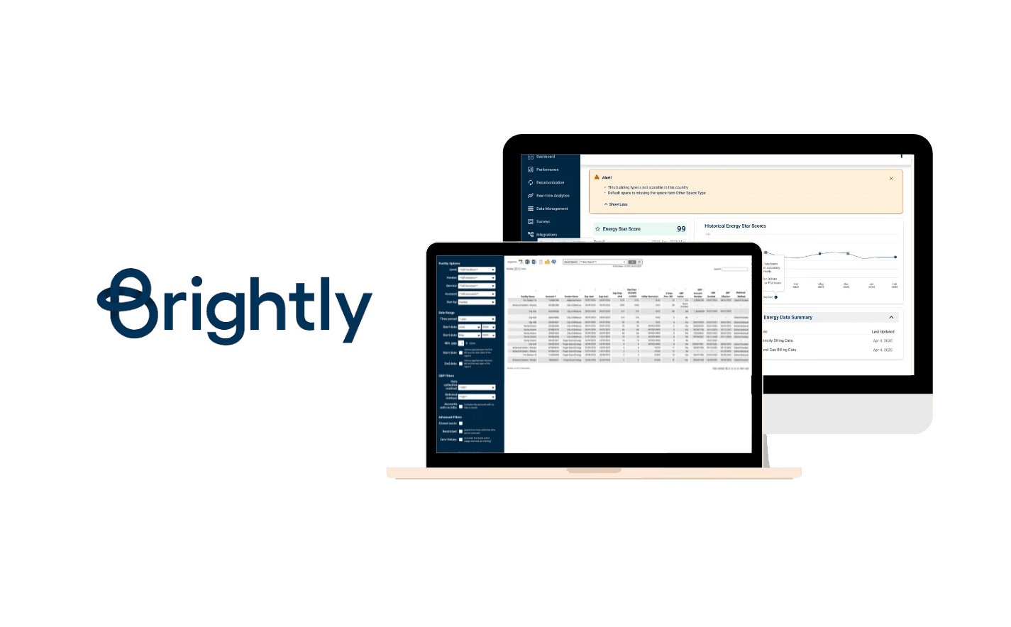
Building Sustainable Solutions at scale

ux research • Ux design • developer handoffs

This case study gives an overview of my work at the internship. Interested in reading the whole case study?

Timeline

8 months

my role

Product Design & Owner Intern

Product Design & Owner Intern

tools

Figma, Pendo, Figjam, Claude Code

4+

Hours/week saved per user

100+

Sustainability Managers empowered

3

Major initiatives led

14

User stories written & refined

Overview

What is Brightly?

Brightly, a Siemens company, builds facilities and sustainability management software used by operations and sustainability teams managing large commercial property portfolios across North America.

What was the design problem?

Sustainability managers using Streams were spending 2–3 hours weekly on manual configuration to get data to and from ENERGY STAR.

They needed to connect their buildings to ENERGY STAR to track energy performance scores, sync utility data, and maintain consistent records across both systems.

This connection didn't exist in a way users could control themselves. It required manual intervention, technical workarounds, and offered no visibility into whether the sync had worked or failed.

My Key Responsibilities

User Research

01

UX Research
  • Performed competitive analysis and workflow mapping.

  • Led user interviews, surveys, and usability testing for Energy Manager and ESPM Integration.

  • Gathered and synthesized user requirements from internal service teams and end-users to identify pain points and opportunities.

User Research

02

UX Design
  • Led the design process for Brightly’s energy monitoring platform integration, from designing wireframes and user flows, to iterating based on feedback, and delivering final designs with user stories for development.

User Research

03

Client Feedback Integration with Pendo
  • Led the migration of historical client feedback into Pendo, Brightly’s product analytics and feedback tool.

  • Completed Pendo Essentials for Workforce Apps certification to ensure effective implementation.

User Research

04

Cross - Functioal Collaboration
  • Worked closely with UX designers, developers, and product owners to align design decisions with technical feasibility and business goals, ensuring smooth handoff from design to development.

  • Leveraged my software development background to identify APIs and provide technical recommendations during PO meetings.

Research

Desk Research

Before designing the flow, I needed to genuinely understand how the benchmarking platform worked. I spent time going through ENERGY STAR’s documentation and working through the platform myself to understand:

  • How accounts, buildings, and meters were structured

  • What a Client ID vs a Building ID actually represented

  • How data sharing between accounts worked

  • What the API could and couldn’t do

Competitive Analysis

In the introductory stakeholder meeting, I asked directly: who is your biggest competitor, or who represents the ideal state you’re trying to reach? The answer was Measurbl.

I used that as my benchmark. I mapped four key flows in Measurbl to understand how they handled similar complexity:

  • Adding sites

  • Connecting to the benchmarking platform

  • Adding a meter

  • Site sync status views

I found out that Measurbl had solved the problem of making data configuration feel manageable for non-technical users through clear step-by-step flows, explicit status indicators, and sensible defaults.

Measurbl’s interface organizes around portfolio entities.

Stream organizes around system functions.

These are fundamentally different mental models, and understanding that gap shaped our IA decisions.

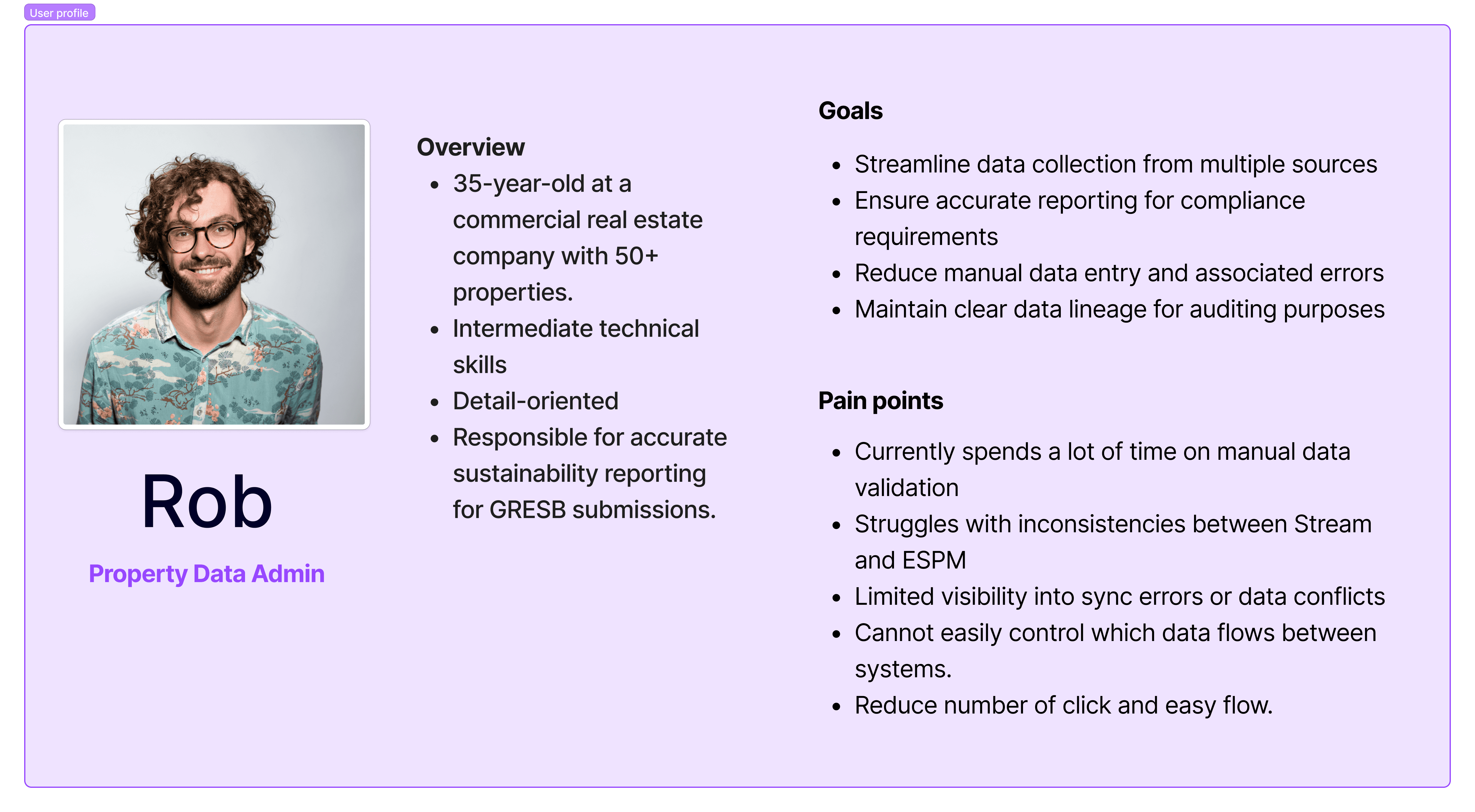
User Persona

We defined a user persona to guide our design decisions

Strategy

Through research and stakeholder alignment, I identified four distinct user scenarios that the feature had to accommodate, each with a fundamentally different starting point:

Scenario 1

New to Stream, no benchmarking account

User needs to be guided to create an account first, then build out their data in Stream, then push it across and enable automatic sync.

Scenario 2

New to Stream, has an existing benchmarking account

User links their existing account, shares properties, and imports building data — which syncs automatically within a day or two. They can also trigger an immediate refresh.

Scenario 3

Has buildings in Stream, not in the benchmarking platform

User creates their benchmarking account, adds the platform as a contact, links the integration, then shares sites and meters with appropriate access levels.

Scenario 4

Has buildings in both systems, not yet synced

The most complex scenario. Requires account-level connection first, followed by building matching — automated suggestions where possible, manual matching where not — then sync configuration per data type.

How might we

Before moving into flows, I framed the design challenge as a set of HMW questions to guide decision-making across all four scenarios:

  • HMW help Rob link Stream buildings to benchmarking platform buildings without requiring him to understand the underlying account structure?

  • HMW make sync direction controls — push, pull, two-way — feel intuitive for someone who thinks in terms of data accuracy, not data architecture?

  • HMW give Rob real visibility into sync status so he can trust the data without manually cross-referencing two platforms?

  • HMW surface errors in plain language so Rob can act on them himself, without filing a support ticket?

  • HMW accommodate four fundamentally different starting points within a single coherent feature?

User Flows

I mapped all four scenarios as user flows before touching a wireframe, because the branching logic had to be resolved at the flow level first. Key decision points across the flows:

  • Account exists vs. doesn’t exist → branches the entire setup path

  • Buildings matched vs. unmatched → determines whether automated suggestions surface or manual entry is required

  • Data type selection → Spaces (two-way sync possible), Utilities (push or pull only), Energy Score (always pulled, never pushed)

  • Sync status → error states, success states, and the overnight delay constraint

Four user flows mapped across distinct starting points — from “no account in either system” to “buildings exist in both but aren’t synced.” Resolving the branching logic at this stage prevented rework at the wireframe level.
view the user flows on figma.

Design

With the user flows resolved across all four scenarios, I moved into wireframes and then high-fidelity design within Brightly’s existing design system.

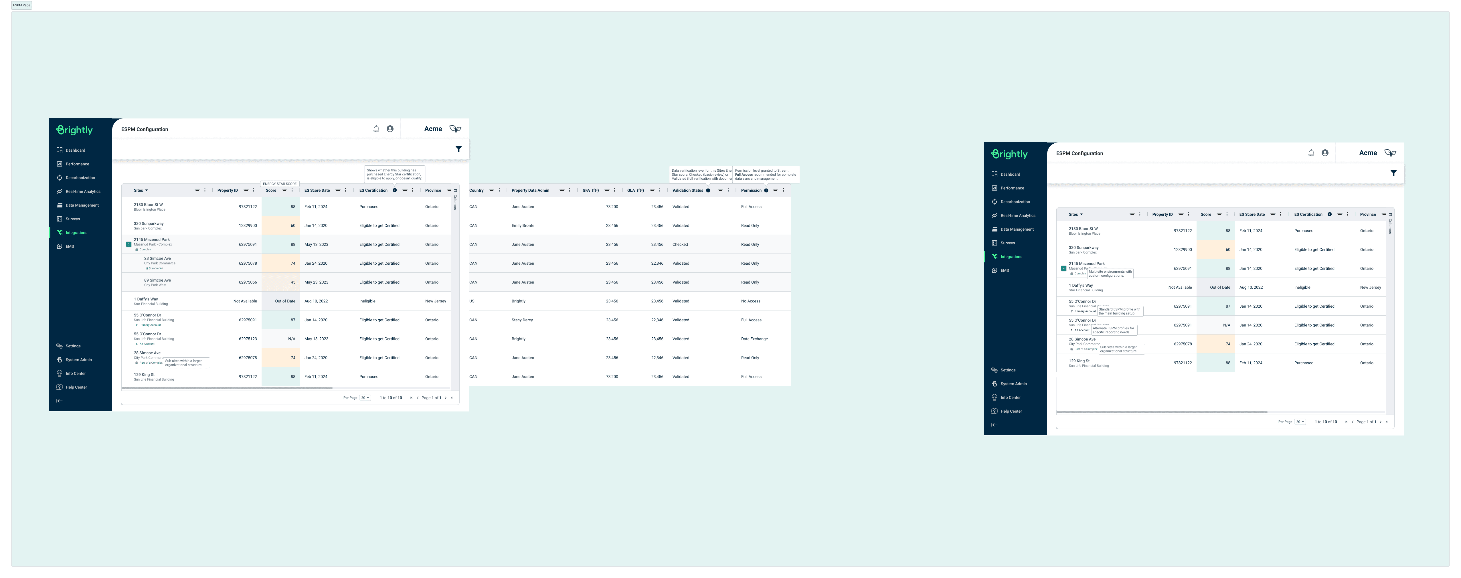
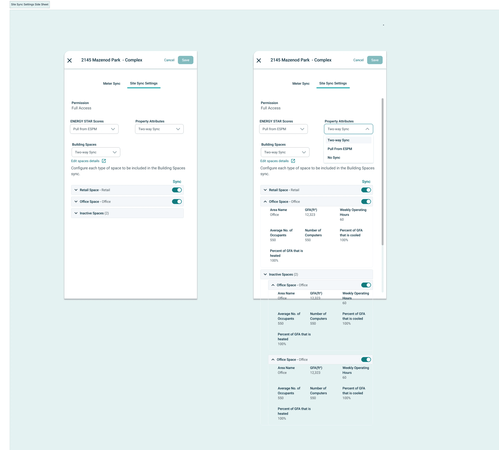
The three core screens I designed were: the ESPM Configuration page, the Meter Sync side sheet, and the Site Sync Settings side sheet. Each solved a distinct part of Rob’s problem.

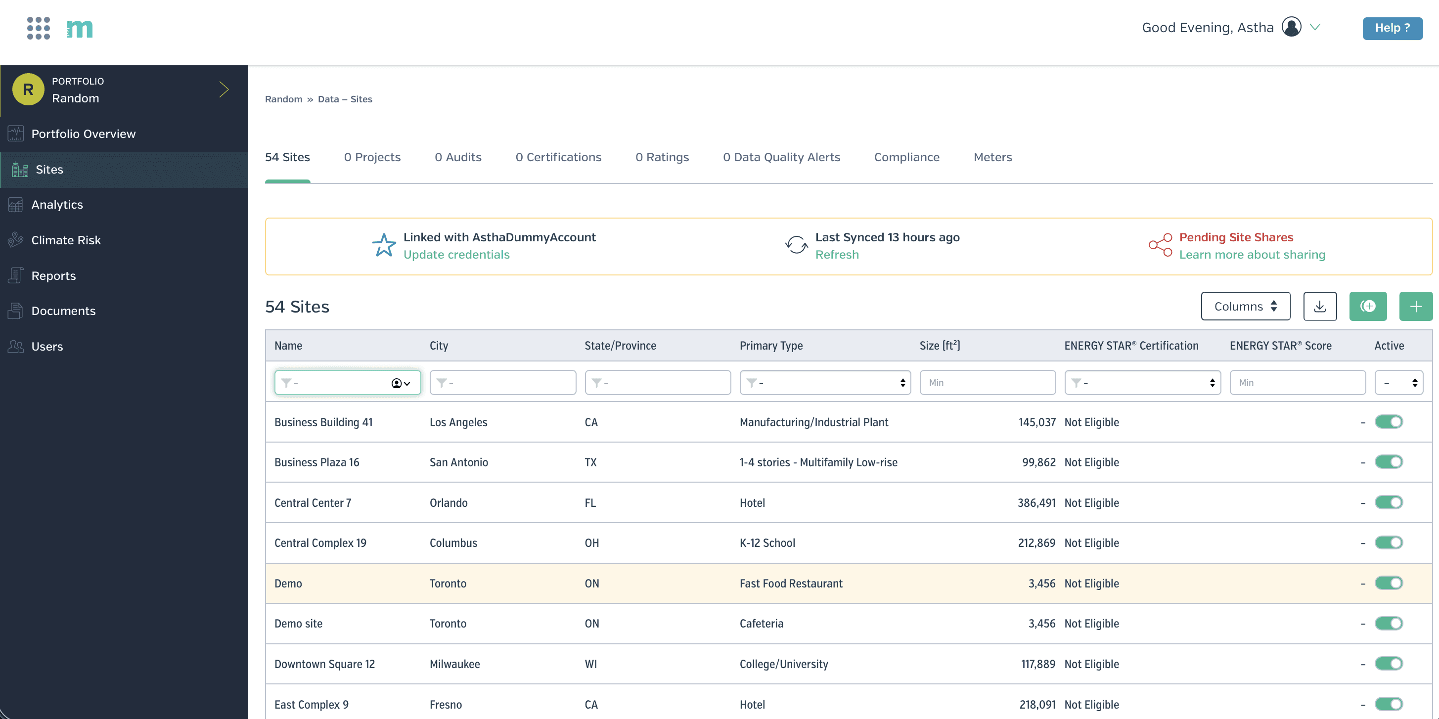
ESPM Configuration Page

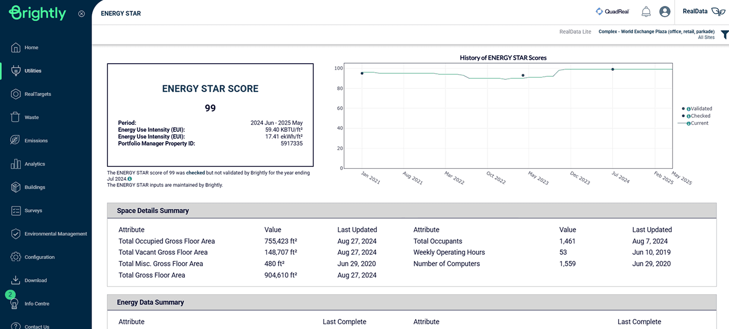
The entry point for the entire feature — a table view showing all connected sites alongside their energy performance scores, certification status, validation status, permission levels, and property data. This screen had to answer Rob’s most immediate question at a glance: which of my buildings are connected, and are they in good shape?

Key design decisions:

  • Tooltips on ambiguous columns so Rob could act without needing documentation

  • Colour-coded ES Score column for quick status scanning without reading every row

  • Permission level visible per site, critical for multi-user admin environments

  • Tags indicating site relationships (complex vs. standalone buildings) surfaced inline

Meter Sync Side Sheet

Once a site is selected, this sheet gives Rob control over how individual meters sync.

Meters are grouped into three categories: meters used to compute metrics, meters not used to compute metrics, and IT meters used for data centre calculations. For each meter, Rob can see the account number, type, ESPM Meter ID, units, sync direction, last sync date, last sync status, and whether it’s an aggregate meter.

Key design decisions:

  • “Sync with ESPM” button positioned on the right, a direct response to usability testing where both testers independently gravitated to that position based on muscle memory from other tools

  • Meter Sync tab surfaces first — testing showed users navigated here immediately; leading with it reduced disorientation

  • 5 meters visible by default rather than 4, a small change that reduced the need to scroll for the most common portfolio sizes

  • Tooltips added to ESPM Meter ID, Sync Direction, and Aggregate Meter columns — the three that caused the most confusion during testing

Test

We prototyped the flows and ran usability testing with internal users. Testing revealed several critical issues that led to meaningful design revisions:

What we found

01
Navigation and labelling were causing confusion
  • The tab label “Site Data Sync” wasn’t landing, users suggested renaming it to “Settings,” which better matched their mental model

  • Tags showing building relationships (complex vs. standalone) were unclear — users couldn’t interpret them without explanation

  • “Historical Spaces” as a label confused users; they responded better to “Inactive Spaces.”

02
Interaction patterns weren’t matching user expectations
  • Both testers independently preferred the sync button on the right side — a muscle memory pattern from tools they already used

  • Users wanted the Meter sync tab to appear first, since that was their immediate priority when entering the screen

  • The number of visible meters (4) felt too few — users wanted to see 5 at a glance before scrolling

03
Status visibility needed more at-a-glance clarity
  • The ES Score column worked well conceptually, but users wanted colour coding to quickly identify sync status without reading individual entries

  • Error messaging needed more context and a downloadable error list for situations where multiple records failed, important for Rob’s auditing workflow

  • Users wanted “last synced by” information visible, knowing who triggered a sync matters in a multi-user admin environment

View the detailed testing notes here.

What Changed

  • Empowered 100+ sustainability managers with direct control over their data synchronization

  • Delivered 14 user stories across 3 major initiatives

  • Eliminated the cross-platform mismatch problem by designing a clear sync state model with a defined source of truth per data type

Before
  • 2–3 hours per manual configuration

  • Required support team intervention

  • No sync status visibility.

  • No control over data direction

After
  • Under 15 minutes

  • Full self Serve

  • Real-time status with plain-language error messages

  • Per-data-type sync configuration

Learnings

Embracing Change: Don’t Get Attached to Every Design

Early on, I learned that it’s perfectly normal for some designs to get descoped or set aside. Rather than taking this personally, I recognized that design decisions are driven by business needs and changing priorities. Maintaining flexibility and focusing on the project’s broader goals allowed me to grow as a resilient and strategic designer.

Adapting to Constraints: Prioritizing What Matters Most

Projects often move fast and sometimes limited budgets and tight timelines mean that not every step can be executed as planned. For example, after initial user testing and implementing feedback, we didn’t have the bandwidth for a second round of formal testing. To ensure some level of insight, I guided a fresh team member through the new designs, asking them to evaluate the experience from a user’s perspective. It wasn’t perfect—but was a practical solution given our constraints.

Knowing When to Push Back: Advocating for Users

It’s important to adapt, but sometimes you have to stand your ground, even under pressure. On one project, internal process stakeholders had already reviewed our UI, and tight deadlines made skipping further user testing tempting. My team and I insisted on a quick round of testing with end users, balancing project urgency with the need for real feedback. This approach ensured our designs genuinely met user needs before launch.

Leveraging Tools for Efficiency: The Value of Auto Layout

Mastering features like auto layout in our design tools greatly accelerated my workflow. It became significantly easier to iterate on designs, incorporate feedback, and prepare files for handoff. This efficiency allowed for rapid refinements and greater overall team agility throughout the project.

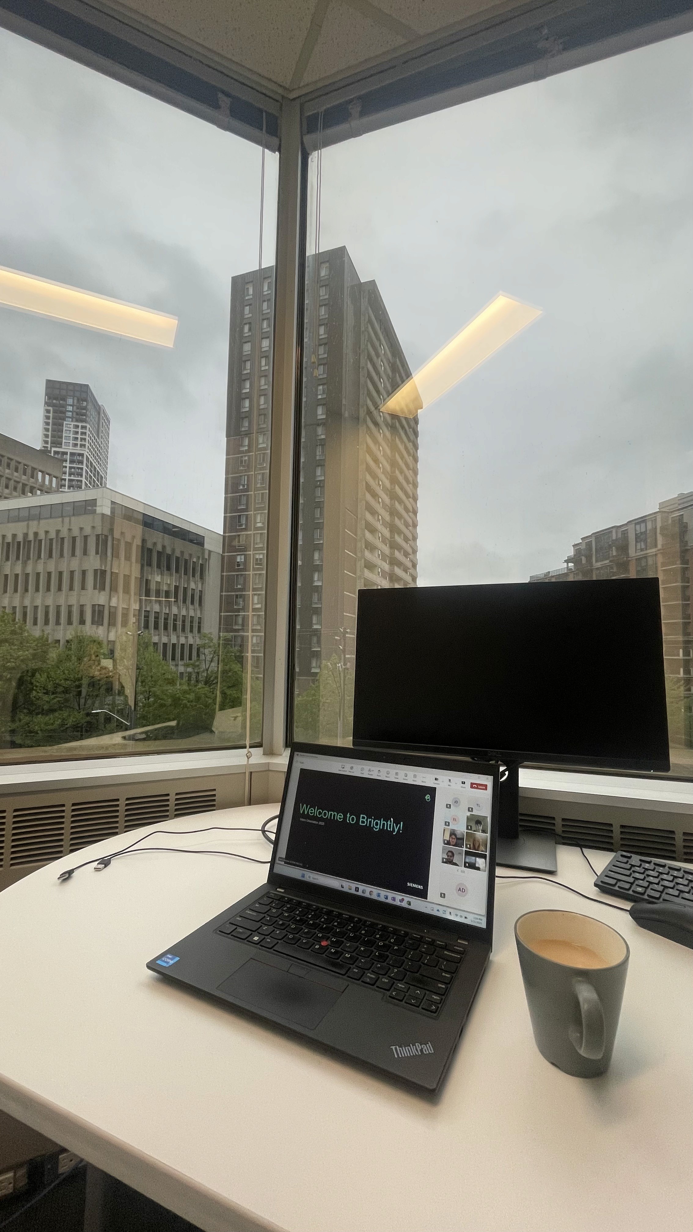
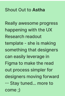
My desk & some appreciations

Overview

What is Brightly?

Brightly, a Siemens company, builds facilities and sustainability management software used by operations and sustainability teams managing large commercial property portfolios across North America.

What was the design problem?

Sustainability managers using Streams were spending 2–3 hours weekly on manual configuration to get data to and from ENERGY STAR.

They needed to connect their buildings to ENERGY STAR to track energy performance scores, sync utility data, and maintain consistent records across both systems.

This connection didn't exist in a way users could control themselves. It required manual intervention, technical workarounds, and offered no visibility into whether the sync had worked or failed.

My Key Responsibilities

User Research

01

UX Research
  • Performed competitive analysis and workflow mapping.

  • Led user interviews, surveys, and usability testing for Energy Manager and ESPM Integration.

  • Gathered and synthesized user requirements from internal service teams and end-users to identify pain points and opportunities.

User Research

02

UX Design
  • Led the design process for Brightly’s energy monitoring platform integration, from designing wireframes and user flows, to iterating based on feedback, and delivering final designs with user stories for development.

User Research

03

Client Feedback Integration with Pendo
  • Led the migration of historical client feedback into Pendo, Brightly’s product analytics and feedback tool.

  • Completed Pendo Essentials for Workforce Apps certification to ensure effective implementation.

User Research

04

Cross - Functioal Collaboration
  • Worked closely with UX designers, developers, and product owners to align design decisions with technical feasibility and business goals, ensuring smooth handoff from design to development.

  • Leveraged my software development background to identify APIs and provide technical recommendations during PO meetings.

Research

Desk Research

Before designing the flow, I needed to genuinely understand how the benchmarking platform worked. I spent time going through ENERGY STAR’s documentation and working through the platform myself to understand:

  • How accounts, buildings, and meters were structured

  • What a Client ID vs a Building ID actually represented

  • How data sharing between accounts worked

  • What the API could and couldn’t do

Competitive Analysis

In the introductory stakeholder meeting, I asked directly: who is your biggest competitor, or who represents the ideal state you’re trying to reach? The answer was Measurbl.

I used that as my benchmark. I mapped four key flows in Measurbl to understand how they handled similar complexity:

  • Adding sites

  • Connecting to the benchmarking platform

  • Adding a meter

  • Site sync status views

I found out that Measurbl had solved the problem of making data configuration feel manageable for non-technical users through clear step-by-step flows, explicit status indicators, and sensible defaults.

Measurbl’s interface organizes around portfolio entities.

Stream organizes around system functions.

These are fundamentally different mental models, and understanding that gap shaped our IA decisions.

User Persona

We defined a user persona to guide our design decisions

Strategy

Through research and stakeholder alignment, I identified four distinct user scenarios that the feature had to accommodate, each with a fundamentally different starting point:

Scenario 1

New to Stream, no benchmarking account

User needs to be guided to create an account first, then build out their data in Stream, then push it across and enable automatic sync.

Scenario 2

New to Stream, has an existing benchmarking account

User links their existing account, shares properties, and imports building data — which syncs automatically within a day or two. They can also trigger an immediate refresh.

Scenario 3

Has buildings in Stream, not in the benchmarking platform

User creates their benchmarking account, adds the platform as a contact, links the integration, then shares sites and meters with appropriate access levels.

Scenario 4

Has buildings in both systems, not yet synced

The most complex scenario. Requires account-level connection first, followed by building matching — automated suggestions where possible, manual matching where not — then sync configuration per data type.

How might we

Before moving into flows, I framed the design challenge as a set of HMW questions to guide decision-making across all four scenarios:

  • HMW help Rob link Stream buildings to benchmarking platform buildings without requiring him to understand the underlying account structure?

  • HMW make sync direction controls — push, pull, two-way — feel intuitive for someone who thinks in terms of data accuracy, not data architecture?

  • HMW give Rob real visibility into sync status so he can trust the data without manually cross-referencing two platforms?

  • HMW surface errors in plain language so Rob can act on them himself, without filing a support ticket?

  • HMW accommodate four fundamentally different starting points within a single coherent feature?

User Flows

I mapped all four scenarios as user flows before touching a wireframe, because the branching logic had to be resolved at the flow level first. Key decision points across the flows:

  • Account exists vs. doesn’t exist → branches the entire setup path

  • Buildings matched vs. unmatched → determines whether automated suggestions surface or manual entry is required

  • Data type selection → Spaces (two-way sync possible), Utilities (push or pull only), Energy Score (always pulled, never pushed)

  • Sync status → error states, success states, and the overnight delay constraint

Four user flows mapped across distinct starting points — from “no account in either system” to “buildings exist in both but aren’t synced.” Resolving the branching logic at this stage prevented rework at the wireframe level.
view the user flows on figma.

Design

With the user flows resolved across all four scenarios, I moved into wireframes and then high-fidelity design within Brightly’s existing design system.

The three core screens I designed were: the ESPM Configuration page, the Meter Sync side sheet, and the Site Sync Settings side sheet. Each solved a distinct part of Rob’s problem.

ESPM Configuration Page

The entry point for the entire feature — a table view showing all connected sites alongside their energy performance scores, certification status, validation status, permission levels, and property data. This screen had to answer Rob’s most immediate question at a glance: which of my buildings are connected, and are they in good shape?

Key design decisions:

  • Tooltips on ambiguous columns so Rob could act without needing documentation

  • Colour-coded ES Score column for quick status scanning without reading every row

  • Permission level visible per site, critical for multi-user admin environments

  • Tags indicating site relationships (complex vs. standalone buildings) surfaced inline

Meter Sync Side Sheet

Once a site is selected, this sheet gives Rob control over how individual meters sync.

Meters are grouped into three categories: meters used to compute metrics, meters not used to compute metrics, and IT meters used for data centre calculations. For each meter, Rob can see the account number, type, ESPM Meter ID, units, sync direction, last sync date, last sync status, and whether it’s an aggregate meter.

Key design decisions:

  • “Sync with ESPM” button positioned on the right, a direct response to usability testing where both testers independently gravitated to that position based on muscle memory from other tools

  • Meter Sync tab surfaces first — testing showed users navigated here immediately; leading with it reduced disorientation

  • 5 meters visible by default rather than 4, a small change that reduced the need to scroll for the most common portfolio sizes

  • Tooltips added to ESPM Meter ID, Sync Direction, and Aggregate Meter columns — the three that caused the most confusion during testing
Test

We prototyped the flows and ran usability testing with internal users. Testing revealed several critical issues that led to meaningful design revisions:

What we found

01
Navigation and labelling were causing confusion
  • The tab label “Site Data Sync” wasn’t landing, users suggested renaming it to “Settings,” which better matched their mental model

  • Tags showing building relationships (complex vs. standalone) were unclear — users couldn’t interpret them without explanation

  • “Historical Spaces” as a label confused users; they responded better to “Inactive Spaces.”

02
Interaction patterns weren’t matching user expectations
  • Both testers independently preferred the sync button on the right side — a muscle memory pattern from tools they already used

  • Users wanted the Meter sync tab to appear first, since that was their immediate priority when entering the screen

  • The number of visible meters (4) felt too few — users wanted to see 5 at a glance before scrolling

03
Status visibility needed more at-a-glance clarity
  • The ES Score column worked well conceptually, but users wanted colour coding to quickly identify sync status without reading individual entries

  • Error messaging needed more context and a downloadable error list for situations where multiple records failed, important for Rob’s auditing workflow

  • Users wanted “last synced by” information visible, knowing who triggered a sync matters in a multi-user admin environment

View the detailed testing notes here.

What Changed

  • Empowered 100+ sustainability managers with direct control over their data synchronization

  • Delivered 14 user stories across 3 major initiatives

  • Eliminated the cross-platform mismatch problem by designing a clear sync state model with a defined source of truth per data type

Before
  • 2–3 hours per manual configuration

  • Required support team intervention

  • No sync status visibility.

  • No control over data direction

After
  • Under 15 minutes

  • Full self Serve

  • Real-time status with plain-language error messages

  • Per-data-type sync configuration

Learnings

Embracing Change: Don’t Get Attached to Every Design

Early on, I learned that it’s perfectly normal for some designs to get descoped or set aside. Rather than taking this personally, I recognized that design decisions are driven by business needs and changing priorities. Maintaining flexibility and focusing on the project’s broader goals allowed me to grow as a resilient and strategic designer.

Adapting to Constraints: Prioritizing What Matters Most

Projects often move fast and sometimes limited budgets and tight timelines mean that not every step can be executed as planned. For example, after initial user testing and implementing feedback, we didn’t have the bandwidth for a second round of formal testing. To ensure some level of insight, I guided a fresh team member through the new designs, asking them to evaluate the experience from a user’s perspective. It wasn’t perfect—but was a practical solution given our constraints.

Knowing When to Push Back: Advocating for Users

It’s important to adapt, but sometimes you have to stand your ground, even under pressure. On one project, internal process stakeholders had already reviewed our UI, and tight deadlines made skipping further user testing tempting. My team and I insisted on a quick round of testing with end users, balancing project urgency with the need for real feedback. This approach ensured our designs genuinely met user needs before launch.

Leveraging Tools for Efficiency: The Value of Auto Layout

Mastering features like auto layout in our design tools greatly accelerated my workflow. It became significantly easier to iterate on designs, incorporate feedback, and prepare files for handoff. This efficiency allowed for rapid refinements and greater overall team agility throughout the project.

My fav desk & some appreciations

Overview

What is Brightly?

Brightly, a Siemens company, builds facilities and sustainability management software used by operations and sustainability teams managing large commercial property portfolios across North America.

What was the design problem?

Sustainability managers using Streams were spending 2–3 hours weekly on manual configuration to get data to and from ENERGY STAR.

They needed to connect their buildings to ENERGY STAR to track energy performance scores, sync utility data, and maintain consistent records across both systems.

This connection didn't exist in a way users could control themselves. It required manual intervention, technical workarounds, and offered no visibility into whether the sync had worked or failed.

My Key Responsibilities

User Research

01

UX Research
  • Performed competitive analysis and workflow mapping.

  • Led user interviews, surveys, and usability testing for Energy Manager and ESPM Integration.

  • Gathered and synthesized user requirements from internal service teams and end-users to identify pain points and opportunities.

User Research

03

Client Feedback Integration with Pendo
  • Led the migration of historical client feedback into Pendo, Brightly’s product analytics and feedback tool.

  • Completed Pendo Essentials for Workforce Apps certification to ensure effective implementation.

User Research

02

UX Design
  • Led the design process for Brightly’s energy monitoring platform integration, from designing wireframes and user flows, to iterating based on feedback, and delivering final designs with user stories for development.

User Research

04

Cross - Functioal Collaboration
  • Worked closely with UX designers, developers, and product owners to align design decisions with technical feasibility and business goals, ensuring smooth handoff from design to development.

  • Leveraged my software development background to identify APIs and provide technical recommendations during PO meetings.

Research

Desk Research

Before designing the flow, I needed to genuinely understand how the benchmarking platform worked. I spent time going through ENERGY STAR’s documentation and working through the platform myself to understand:

  • How accounts, buildings, and meters were structured

  • What a Client ID vs a Building ID actually represented

  • How data sharing between accounts worked

  • What the API could and couldn’t do

Competitive Analysis

In the introductory stakeholder meeting, I asked directly: who is your biggest competitor, or who represents the ideal state you’re trying to reach? The answer was Measurbl.

I used that as my benchmark. I mapped four key flows in Measurbl to understand how they handled similar complexity:

  • Adding sites

  • Connecting to the benchmarking platform

  • Adding a meter

  • Site sync status views

I found out that Measurbl had solved the problem of making data configuration feel manageable for non-technical users through clear step-by-step flows, explicit status indicators, and sensible defaults.

Measurbl’s interface organizes around portfolio entities.

Stream organizes around system functions.

These are fundamentally different mental models, and understanding that gap shaped our IA decisions.

User Persona

We defined a user persona to guide our design decisions

Strategy

Through research and stakeholder alignment, I identified four distinct user scenarios that the feature had to accommodate, each with a fundamentally different starting point:

Scenario 1

New to Stream, no benchmarking account

User needs to be guided to create an account first, then build out their data in Stream, then push it across and enable automatic sync.

Scenario 2

New to Stream, has an existing benchmarking account

User links their existing account, shares properties, and imports building data — which syncs automatically within a day or two. They can also trigger an immediate refresh.

Scenario 3

Has buildings in Stream, not in the benchmarking platform

User creates their benchmarking account, adds the platform as a contact, links the integration, then shares sites and meters with appropriate access levels.

Scenario 4

Has buildings in both systems, not yet synced

The most complex scenario. Requires account-level connection first, followed by building matching — automated suggestions where possible, manual matching where not — then sync configuration per data type.

How might we

Before moving into flows, I framed the design challenge as a set of HMW questions to guide decision-making across all four scenarios:

  • HMW help Rob link Stream buildings to benchmarking platform buildings without requiring him to understand the underlying account structure?

  • HMW make sync direction controls — push, pull, two-way — feel intuitive for someone who thinks in terms of data accuracy, not data architecture?

  • HMW give Rob real visibility into sync status so he can trust the data without manually cross-referencing two platforms?

  • HMW surface errors in plain language so Rob can act on them himself, without filing a support ticket?

  • HMW accommodate four fundamentally different starting points within a single coherent feature?

User Flows

I mapped all four scenarios as user flows before touching a wireframe, because the branching logic had to be resolved at the flow level first. Key decision points across the flows:

  • Account exists vs. doesn’t exist → branches the entire setup path

  • Buildings matched vs. unmatched → determines whether automated suggestions surface or manual entry is required

  • Data type selection → Spaces (two-way sync possible), Utilities (push or pull only), Energy Score (always pulled, never pushed)

  • Sync status → error states, success states, and the overnight delay constraint

Four user flows mapped across distinct starting points — from “no account in either system” to “buildings exist in both but aren’t synced.” Resolving the branching logic at this stage prevented rework at the wireframe level.
view the user flows on figma.

Design

With the user flows resolved across all four scenarios, I moved into wireframes and then high-fidelity design within Brightly’s existing design system.

The three core screens I designed were: the ESPM Configuration page, the Meter Sync side sheet, and the Site Sync Settings side sheet. Each solved a distinct part of Rob’s problem.

ESPM Configuration Page

The entry point for the entire feature — a table view showing all connected sites alongside their energy performance scores, certification status, validation status, permission levels, and property data. This screen had to answer Rob’s most immediate question at a glance: which of my buildings are connected, and are they in good shape?

Key design decisions:

  • Tooltips on ambiguous columns so Rob could act without needing documentation

  • Colour-coded ES Score column for quick status scanning without reading every row

  • Permission level visible per site, critical for multi-user admin environments

  • Tags indicating site relationships (complex vs. standalone buildings) surfaced inline

Meter Sync Side Sheet

Once a site is selected, this sheet gives Rob control over how individual meters sync.

Meters are grouped into three categories: meters used to compute metrics, meters not used to compute metrics, and IT meters used for data centre calculations. For each meter, Rob can see the account number, type, ESPM Meter ID, units, sync direction, last sync date, last sync status, and whether it’s an aggregate meter.

Key design decisions:

  • “Sync with ESPM” button positioned on the right, a direct response to usability testing where both testers independently gravitated to that position based on muscle memory from other tools

  • Meter Sync tab surfaces first — testing showed users navigated here immediately; leading with it reduced disorientation

  • 5 meters visible by default rather than 4, a small change that reduced the need to scroll for the most common portfolio sizes

  • Tooltips added to ESPM Meter ID, Sync Direction, and Aggregate Meter columns — the three that caused the most confusion during testing
Test

We prototyped the flows and ran usability testing with internal users. Testing revealed several critical issues that led to meaningful design revisions:

What we found

01
Navigation and labelling were causing confusion
  • The tab label “Site Data Sync” wasn’t landing, users suggested renaming it to “Settings,” which better matched their mental model

  • Tags showing building relationships (complex vs. standalone) were unclear — users couldn’t interpret them without explanation

  • “Historical Spaces” as a label confused users; they responded better to “Inactive Spaces.”

02
Interaction patterns weren’t matching user expectations
  • Both testers independently preferred the sync button on the right side — a muscle memory pattern from tools they already used

  • Users wanted the Meter sync tab to appear first, since that was their immediate priority when entering the screen

  • The number of visible meters (4) felt too few — users wanted to see 5 at a glance before scrolling

03
Status visibility needed more at-a-glance clarity
  • The ES Score column worked well conceptually, but users wanted colour coding to quickly identify sync status without reading individual entries

  • Error messaging needed more context and a downloadable error list for situations where multiple records failed, important for Rob’s auditing workflow

  • Users wanted “last synced by” information visible, knowing who triggered a sync matters in a multi-user admin environment

View the detailed testing notes here.

What Changed

  • Empowered 100+ sustainability managers with direct control over their data synchronization

  • Delivered 14 user stories across 3 major initiatives

  • Eliminated the cross-platform mismatch problem by designing a clear sync state model with a defined source of truth per data type

Before
  • 2–3 hours per manual configuration

  • Required support team intervention

  • No sync status visibility.

  • No control over data direction

After
  • Under 15 minutes

  • Full self Serve

  • Real-time status with plain-language error messages

  • Per-data-type sync configuration

Learnings

Embracing Change: Don’t Get Attached to Every Design

Early on, I learned that it’s perfectly normal for some designs to get descoped or set aside. Rather than taking this personally, I recognized that design decisions are driven by business needs and changing priorities. Maintaining flexibility and focusing on the project’s broader goals allowed me to grow as a resilient and strategic designer.

Adapting to Constraints: Prioritizing What Matters Most

Projects often move fast and sometimes limited budgets and tight timelines mean that not every step can be executed as planned. For example, after initial user testing and implementing feedback, we didn’t have the bandwidth for a second round of formal testing. To ensure some level of insight, I guided a fresh team member through the new designs, asking them to evaluate the experience from a user’s perspective. It wasn’t perfect—but was a practical solution given our constraints.

Knowing When to Push Back: Advocating for Users

It’s important to adapt, but sometimes you have to stand your ground, even under pressure. On one project, internal process stakeholders had already reviewed our UI, and tight deadlines made skipping further user testing tempting. My team and I insisted on a quick round of testing with end users, balancing project urgency with the need for real feedback. This approach ensured our designs genuinely met user needs before launch.

Leveraging Tools for Efficiency: The Value of Auto Layout

Mastering features like auto layout in our design tools greatly accelerated my workflow. It became significantly easier to iterate on designs, incorporate feedback, and prepare files for handoff. This efficiency allowed for rapid refinements and greater overall team agility throughout the project.

My desk & some appreciations

Protected case study

Enter the password to view this project.

Got a design problem worth solving, or want to talk shop?

I'd love to connect.

Got a design problem worth solving, or want to talk shop?

I'd love to connect.

Got a design problem worth solving, or want to talk shop?

I'd love to connect.

Designed and occasionally overthought by Astha Dhami ©

2026